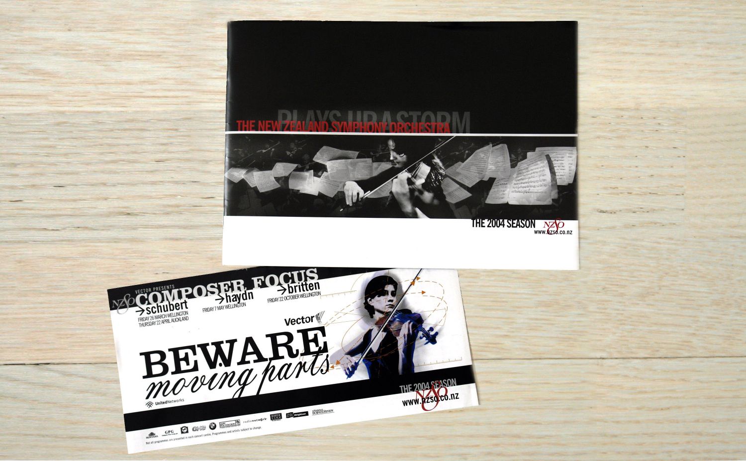
A rejuvenated identity to appeal to a younger demographic was the brief for the NZSO’s 2004 season design. With a brace of art music design already under my belt, this was something we were totally ready to take on.
Rather than get hung up on logos and colours and suchlike, we opted to get close up to present an understated, intimate, grainy portrait of the orchestra, and the drama of its real performance dynamics. This was directly opposite to previous visual promotions, which (with the exception of some steller work by Saatchis) had tended to come across as overly try-hard, and inconsistent.
The creative team included art photographers Wayne Wilson and Fiona Pardington, and a range of developers and production talent. Its probably fair to say that the results, applied through posters, programs, bus-backs and online, is still remembered by some as a high water mark in the NZSO’s visual design history, and after some, frankly fallow years, it's great to see the NZSO return to this approach more recently.
