There's something about a bigger scale that has always attracted me.
And that's never really gone away, even while designing for mobile devices has offered an only ever-shrinking canvas. Working in music drove this particularly home - having grown up with 12" vinyl covers, designing for CDs (within what has to be one of the world's greatest packaging technology disasters… the jewel case), and finally reduced to icon sized thumbnails on itunes. Only to be shrunk even further on streaming apps.
But by then I was gone baby, gone.
Perhaps it's having a few generations of architects behind me, perhaps it's a long-standing perspective of graphic design's place as part of a common design discipline, I'm not sure, but even when I was studying design I entertained the idea of large scale interior graphics, like billboards but rather than hawking stuff, projecting the occupants values and culture, or perhaps to inspire towards something… well, more.
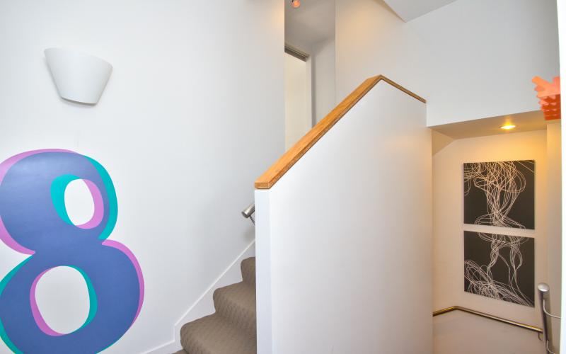
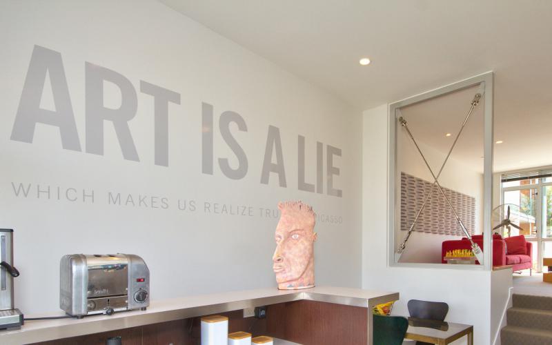
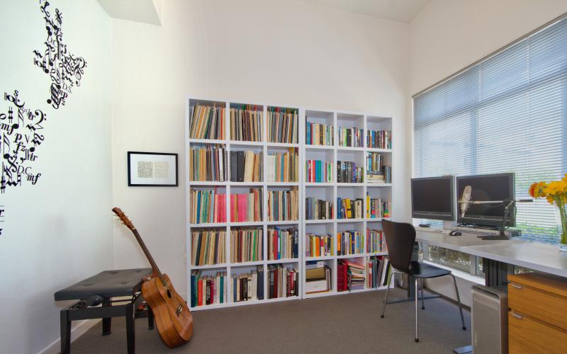
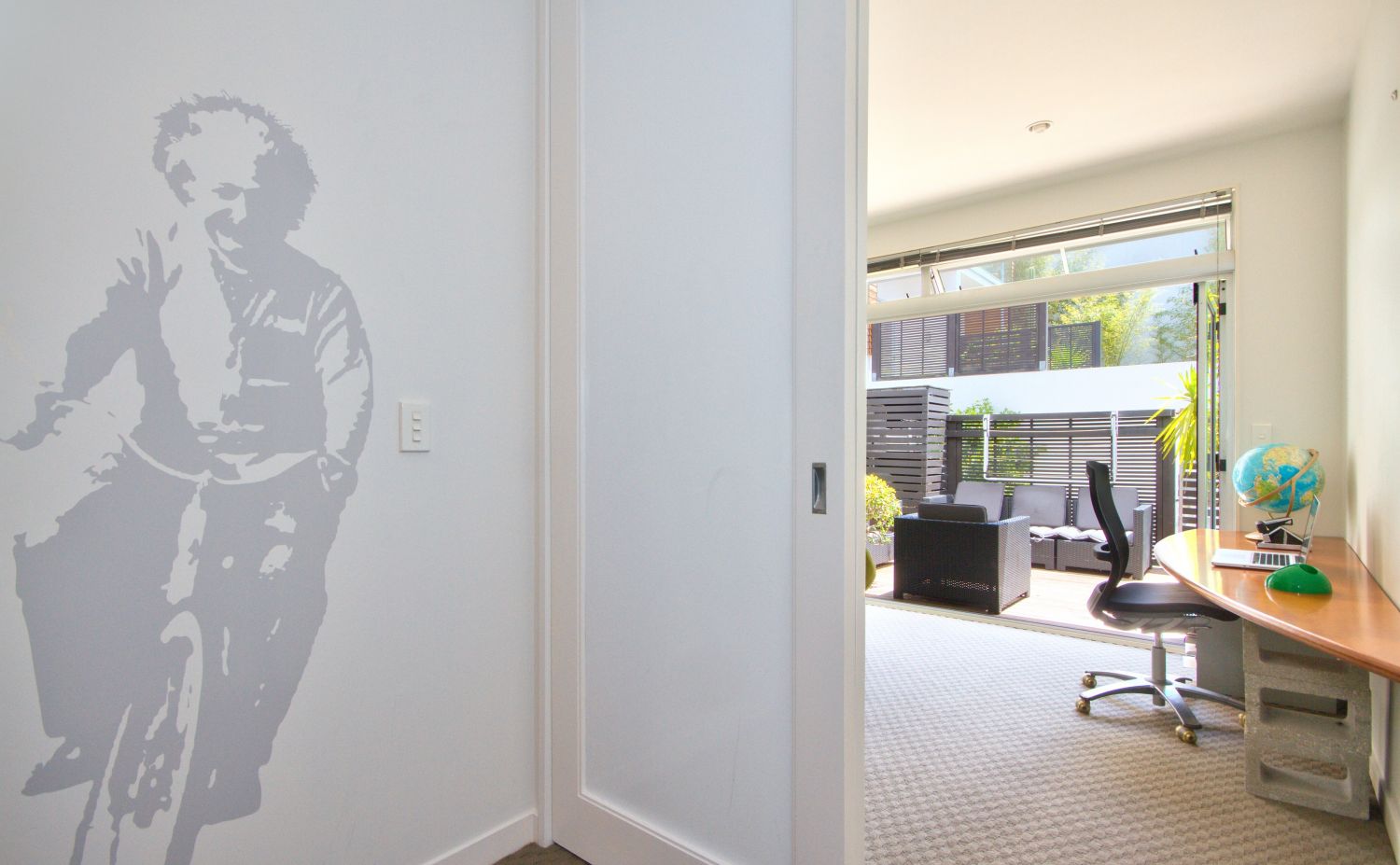
But in a decade of design I'd done nothing of the kind. So when it came to refurbishing our living/working space for sale, and looking for simple ways to add something special to our offering, the notion of large scale, semi-permanent graphics just made sense – particularly as I'd been imagining the graphic potential of the space for some time. As with a lot of refurbs, it's sadly only when a home is put up for market that we get to do some of those things we'd long thought about.
 The space itself is a 'multi-multi' level apartment in Auckland's Beaument Quarter - 3.5 levels staggered to feel like six, balancing two bedrooms with two workspaces: Sarah's music room and my design studio. Do we even have 'studio's any more? I find myself clinging to that moniker, even if a bit aspirationally at times.
Because selling up marked the close of not just a chapter but a LOTR-scale volume in our lives, I wanted the themes to acknowledge our history, as well as provide future occupants some gentle, cultural and behavioural nudges. "Smarter" works on a number of levels I hope.  "Art Is A Lie" is a full on challenge to anyone coming up the stairs, but once you're aware of the qualifying subtitle (the quote is from Picasso) it maintains the easy narrative tension of a suspended bridge.
 It's not like there's been no enjoyment to be had, after sale I got to stay on for a few months, but now I've had a taste, my appetite is wetted, and I'm wondering where next with this? Coming soon to a wall near you?

