
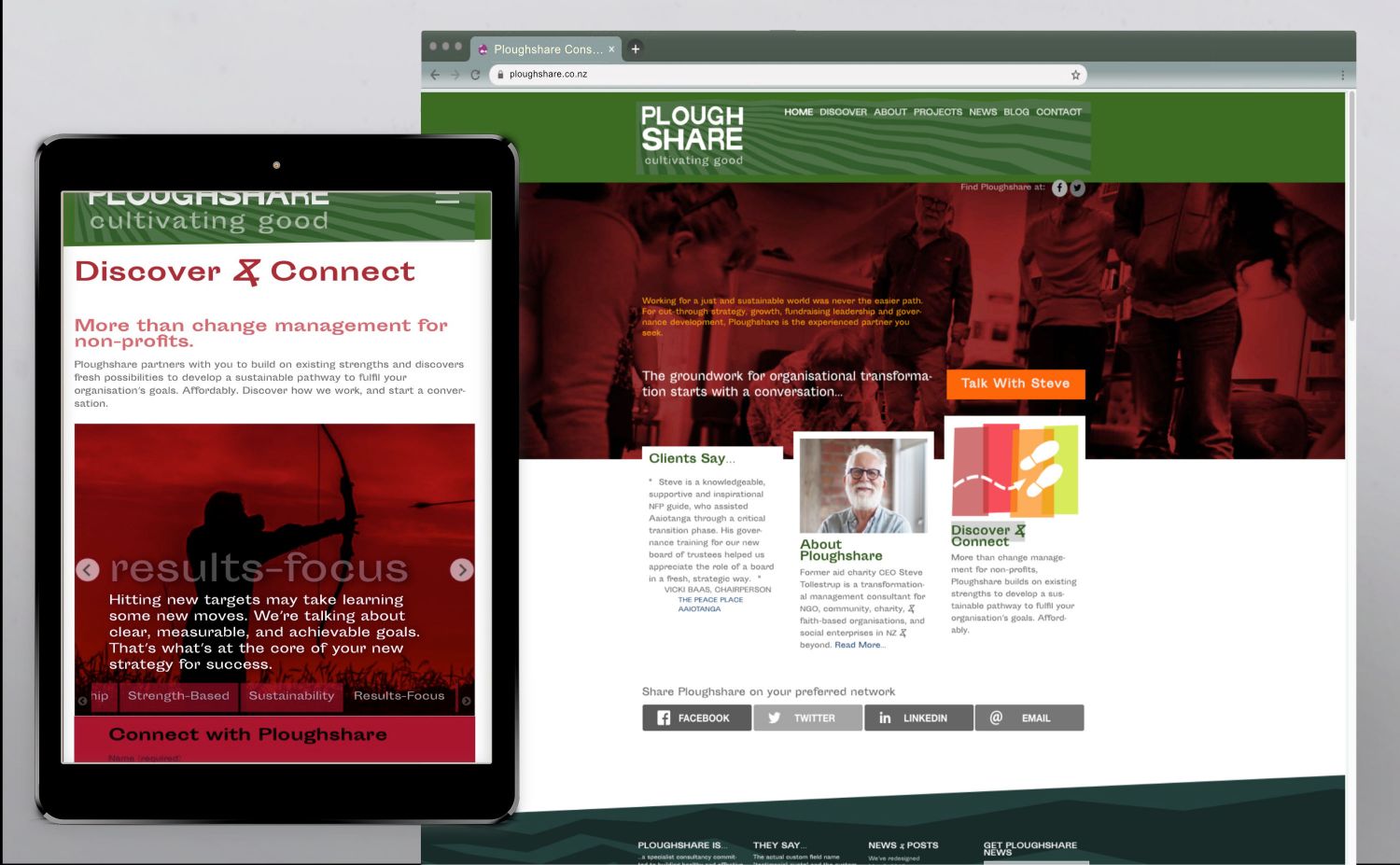
From his decades as CEO of the TEARfund aid charity, consultant Steve Tollestrup is well familiar with communications design process. So it was a special pleasure to to work with Steve when it came time to refresh his Ploughshare branding and a tired, 'mobile-unfriendly' Wordpress website.
Branding empowerment
A specialist consultancy active building healthy and effective third sector organisations, Ploughshare wasn't looking for a cookie-cutter presence. Steve's focus on non-profit and community organisations, charities, NGOs, faith based organisations, missions and social enterprises, was grounded in liberating and empowering communities to act.
Our approach to branding connected more with the tagline: "cultivating good". Given the newer contemporary meaning of the word "share" we dropped the more obscure plough imagery and instead spelt out what a ploughshare actually does - furrow the ground, enabling good things to grow. With a nod to Saul Bass's graphical flat world, where everything is just a wee bit off. OK, perhaps more than 'just a wee bit'.
Pixel-imperfect, and proud
Typography played a key part in creating points of difference, and allude to the less than easy struggle for social justice, which the consultancy serves. For the logo, we took Cheap Signage (yes that really is the font name) and made it cheaper.
For body type, we explored a typographical category known in our trade as grotesques. Sporting Grotesque came to the rescue. Sporting Grotesque seemed to have the unapologetic sense of being just a bit off, and not ashamed about it. This is a face that not everyone will love, but perhaps more than just it's mother. Sporting has quirky lower case letter "a", and the ampersand's striking similarity with Extinction Rebellion's cut-through logo, wasn't going to do any harm.
We were entrusted to be hand's on with photography, written content, SEO, and social media assets, and integrate a branded mailchimp newsletter.
Making it easy to answer the call
For the website, rather than an immediate intrusive popup, we developed a new call to action 'destination design' which integrates storytelling visuals with a response form for engagement.
Social justice isn't the easiest gig, but for Ploughshare Consulting, we hope we've made help for social justice warriors, just a bit easier to find.
"Working with Tim was a great experience. He is a an extraordinary creative talent, with an insightful and intuitive grasp of what I was wanting to achieve for Ploughshare's branding and site.
Tim kept within budget and was a patient guide throughout the entire process. I will recommend him to any of my clients without question".
Steve Tollestrup, Ploughshare