Skip to main content
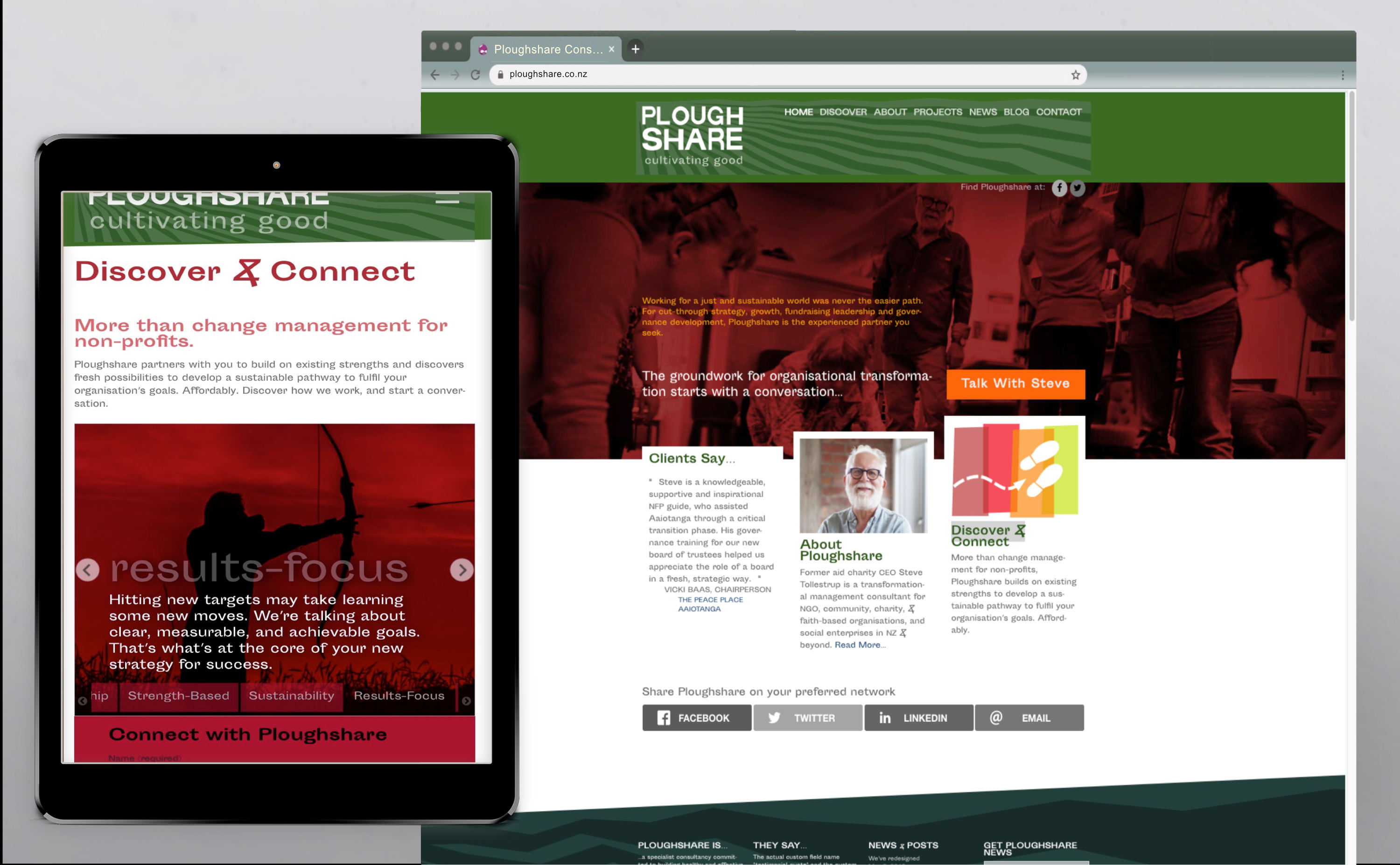
For a specialist consultant, assisting not-for-profit organisations, cookie-cutter branding and web UX wasn't going to cut it. So we knew we were speaking the same (design) language.
Read More
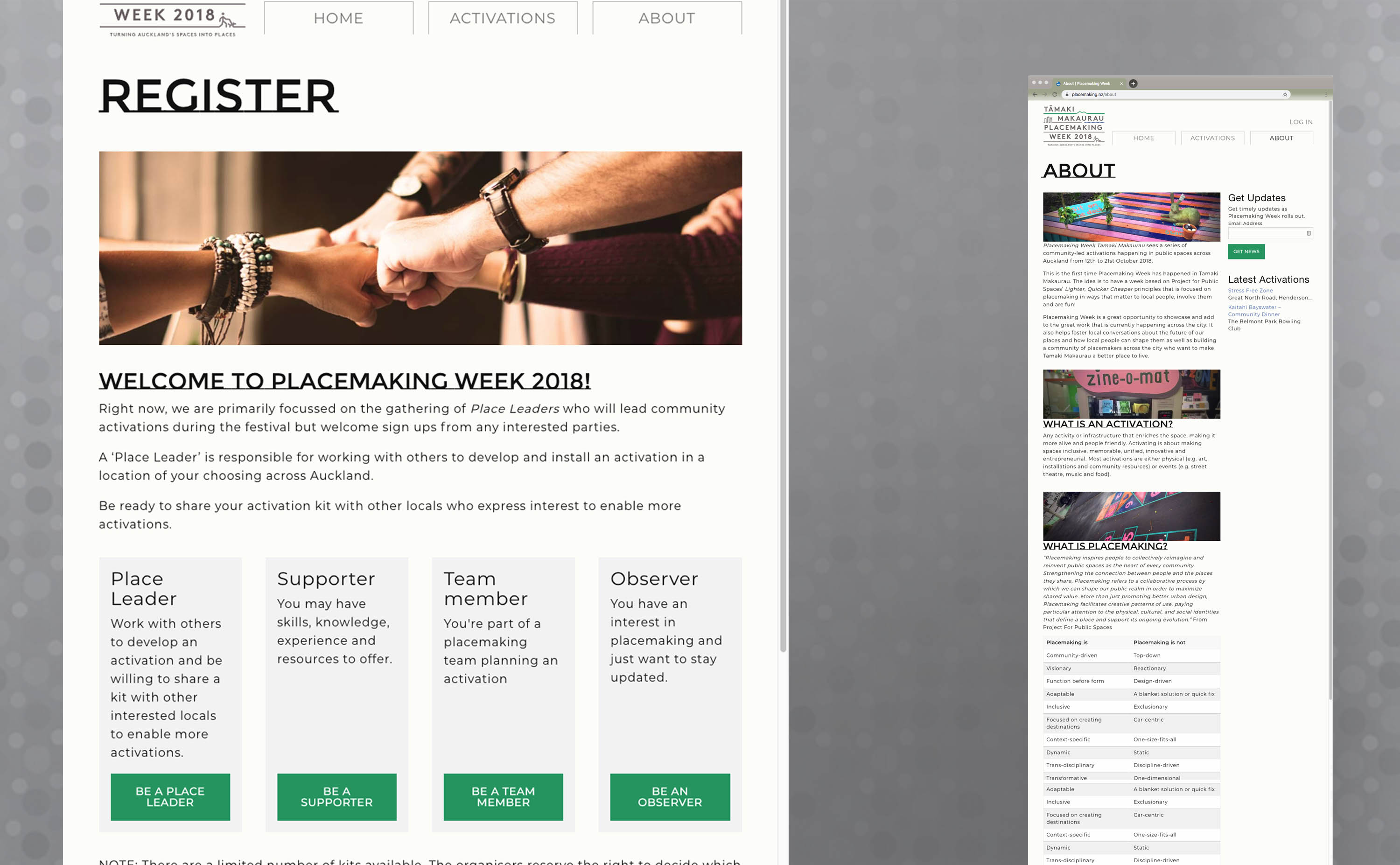
We created placemaking.nz to help ‘Place Leaders’ get their tactical urbanism ‘Activations’ quite literally, on the map
Read More
Critical to effective community development is passing on the learnings. Exchangecollaborative.nz was commissioned to ensure that community development among migrant women
Read More
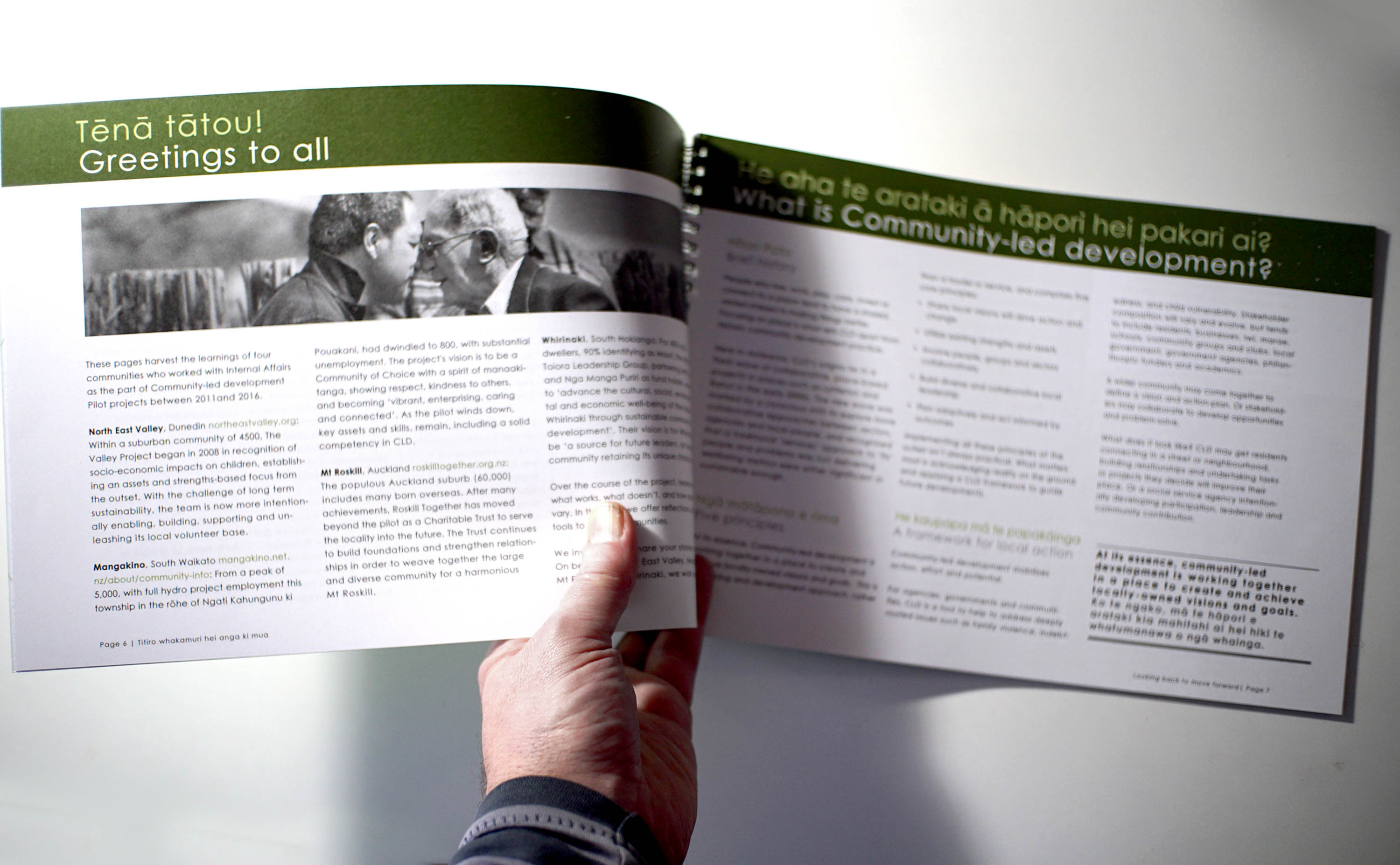
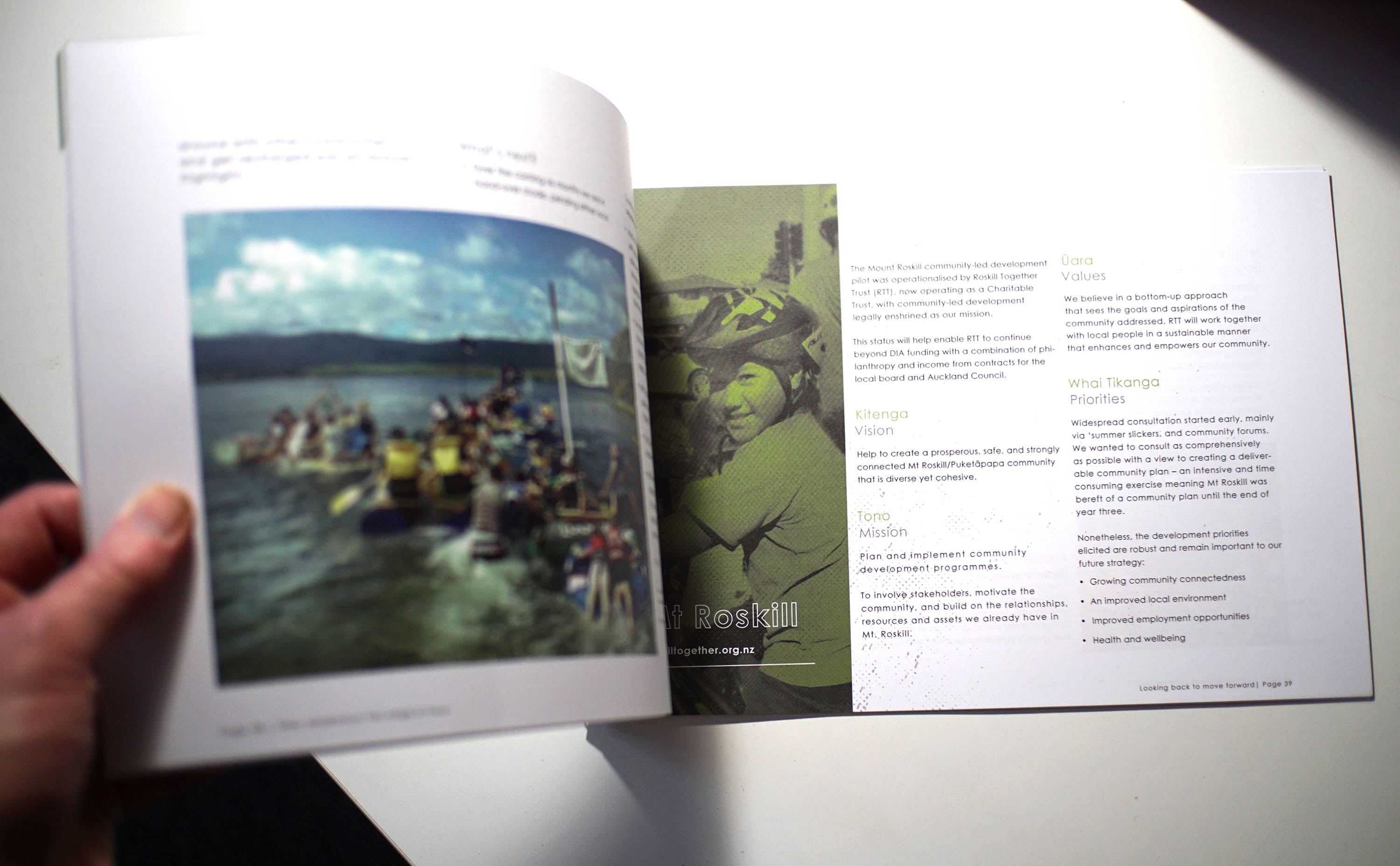
Commissioned to edit and present reporting on critical community development pilots, Looking Back to Look Forward drew heavily on our sector experience, and content creation capability.
Read More
This Wordpress community development site, may be small, but we didn’t skim on anything - front end or back.
Read More
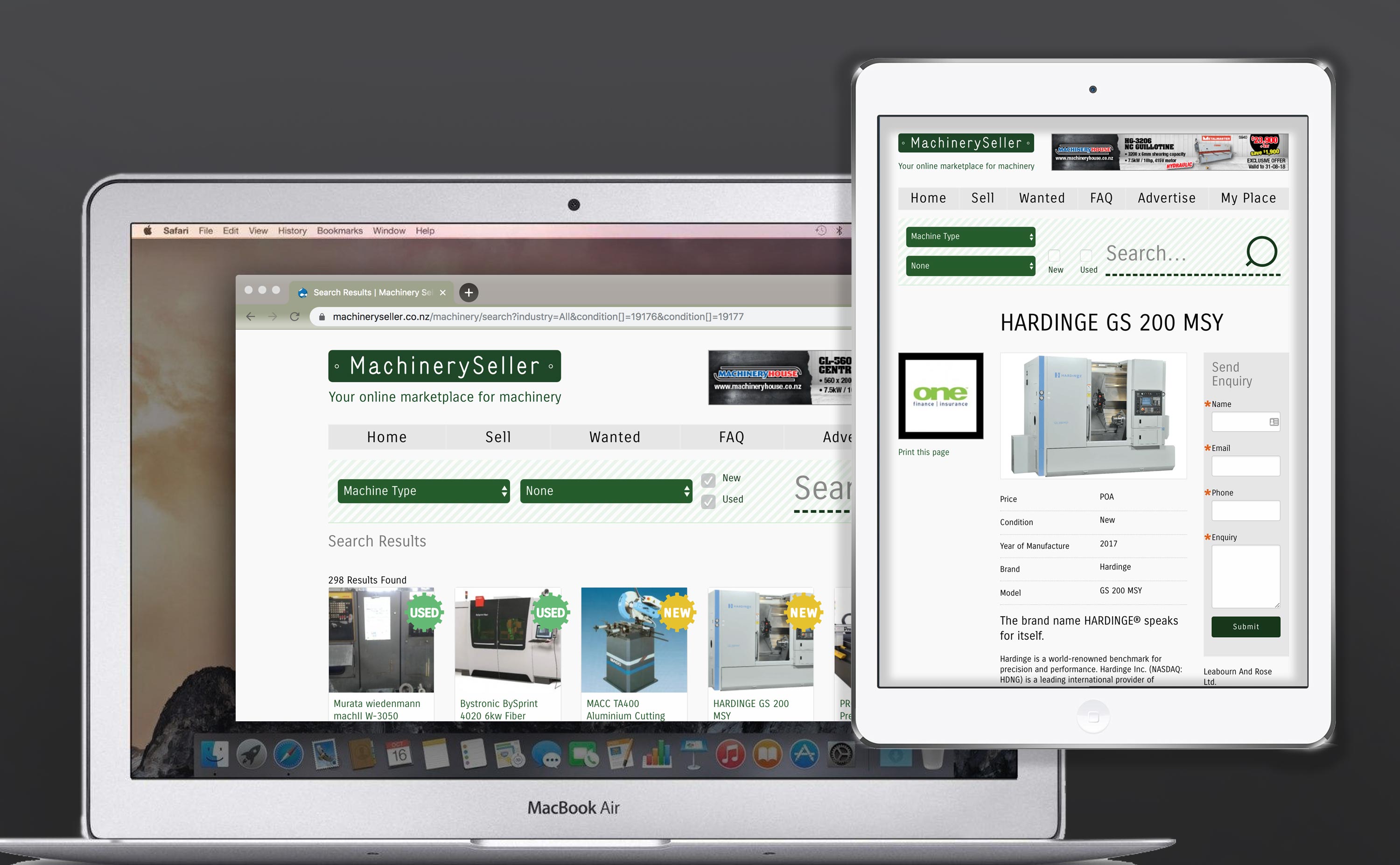
Transition Machinery Seller's Drupal commerce based platform to a new subscription model, was at the heart of this brief.
Read More
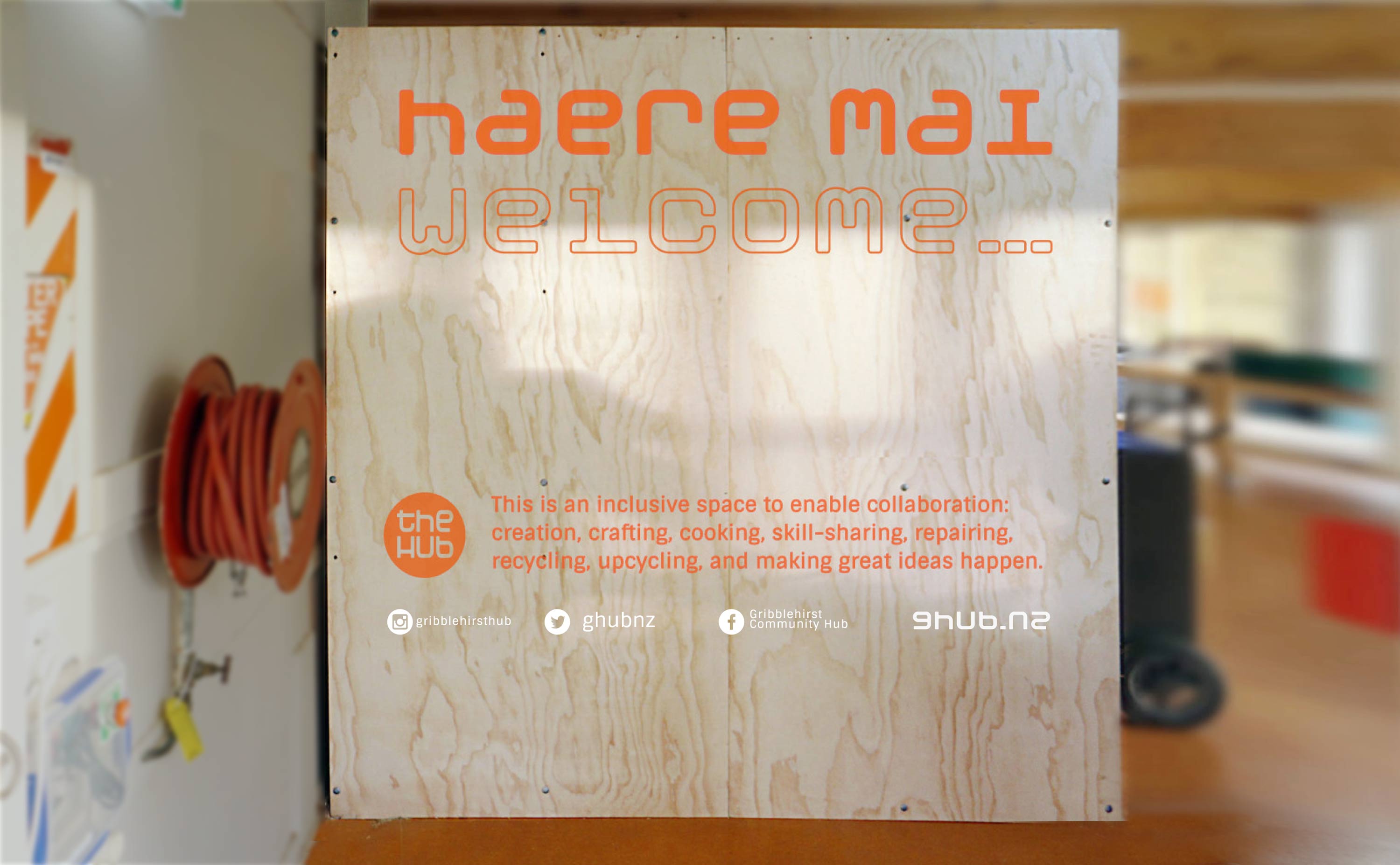
This new neighbourhood hub is ambitious to build community. A light front-end belies some strong bones beneath.
Read More
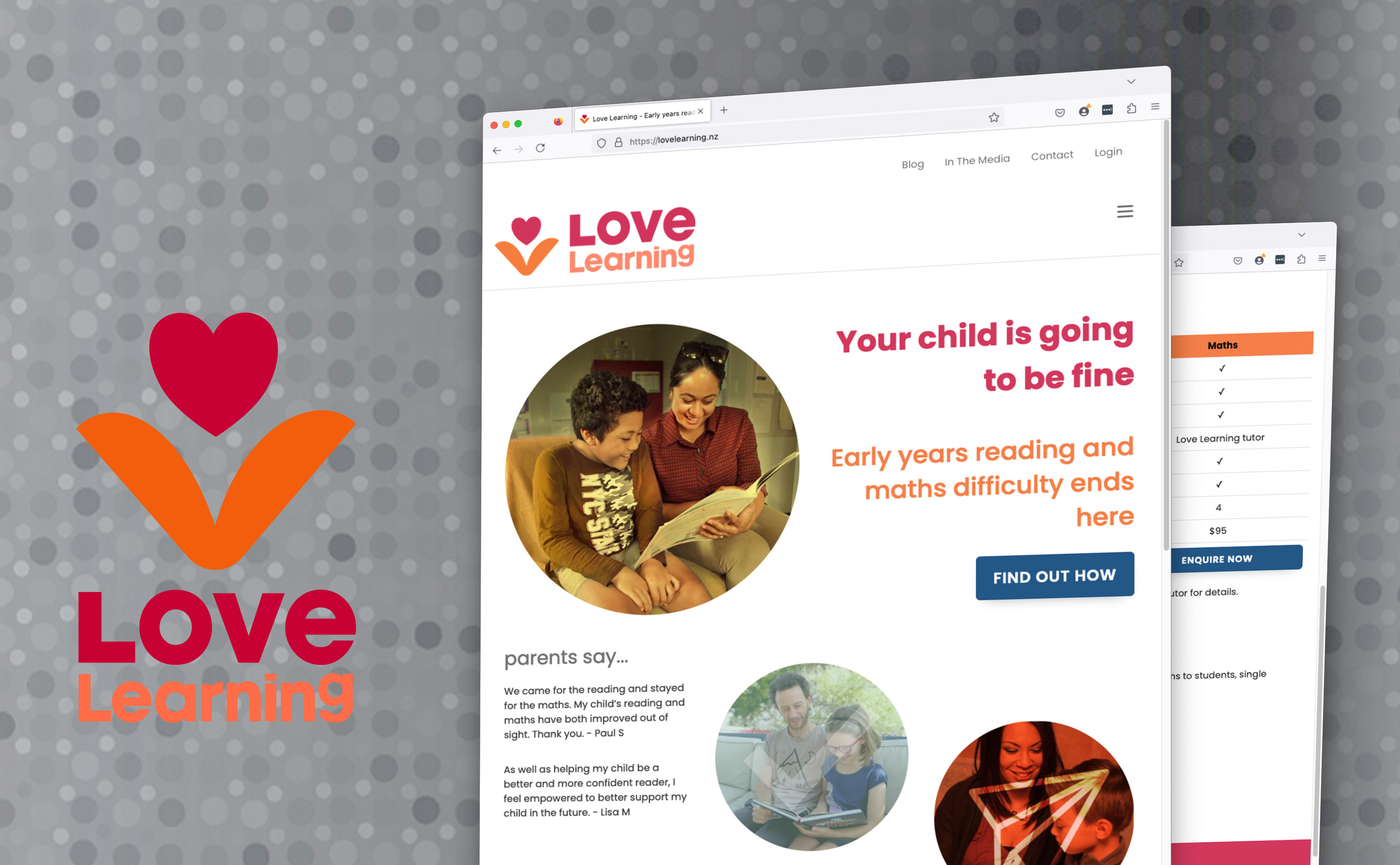
This remedial reading innovator got Digital strategy, some atypically logo-centric branding and initial site development, SEO, and content support.
Read More
Successful advocacy group Bike East Bay had a whole mess o' Drupal going on, now it was time to shift gear.
Read More
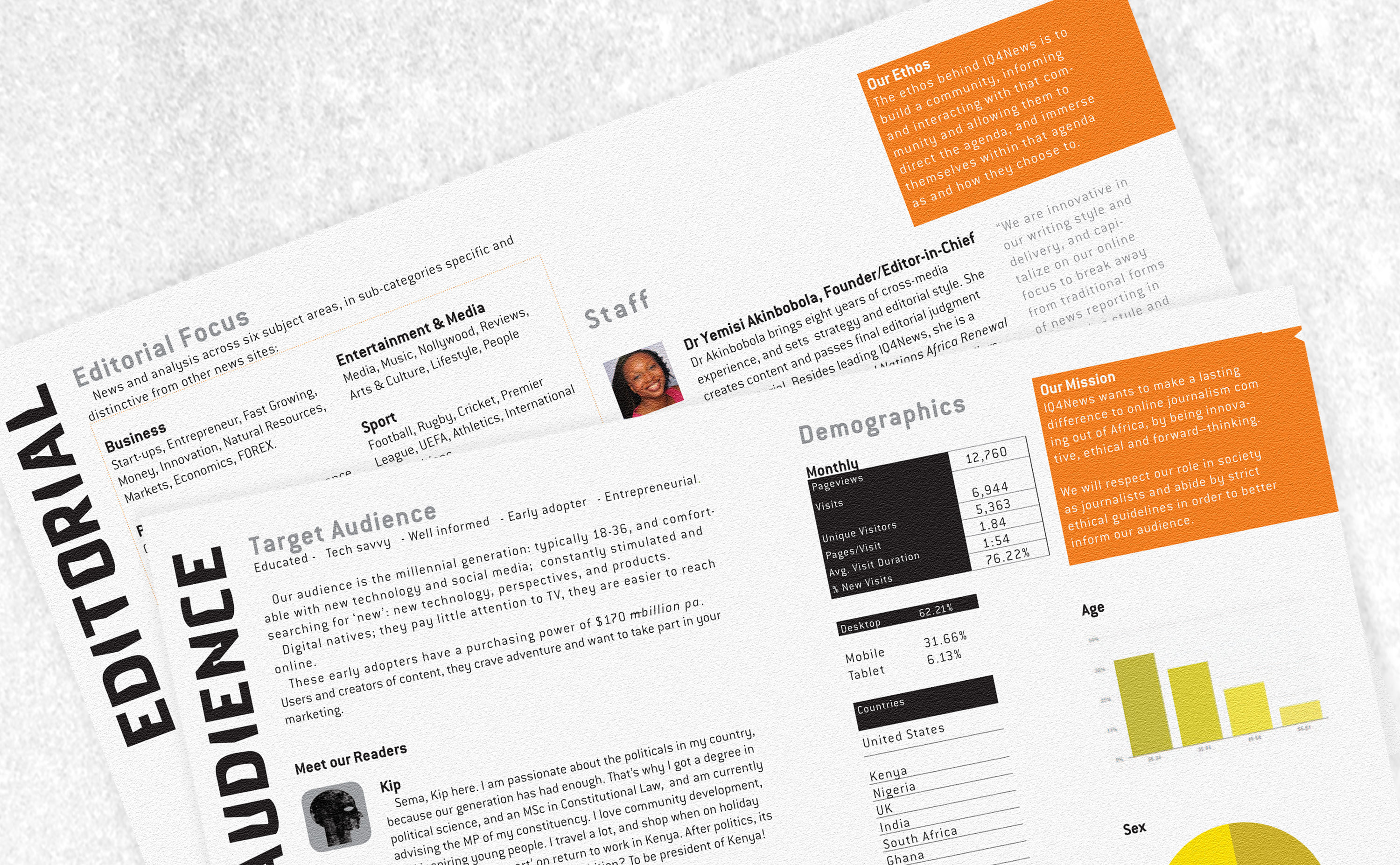
A plucky indie african news service wanted an ID with the edge to represent it's journalistic acuity.
Read More
UNEP needed a site to support their efforts to protect flyways for bird-life migrating back and forth between Europe and Africa.
Read More
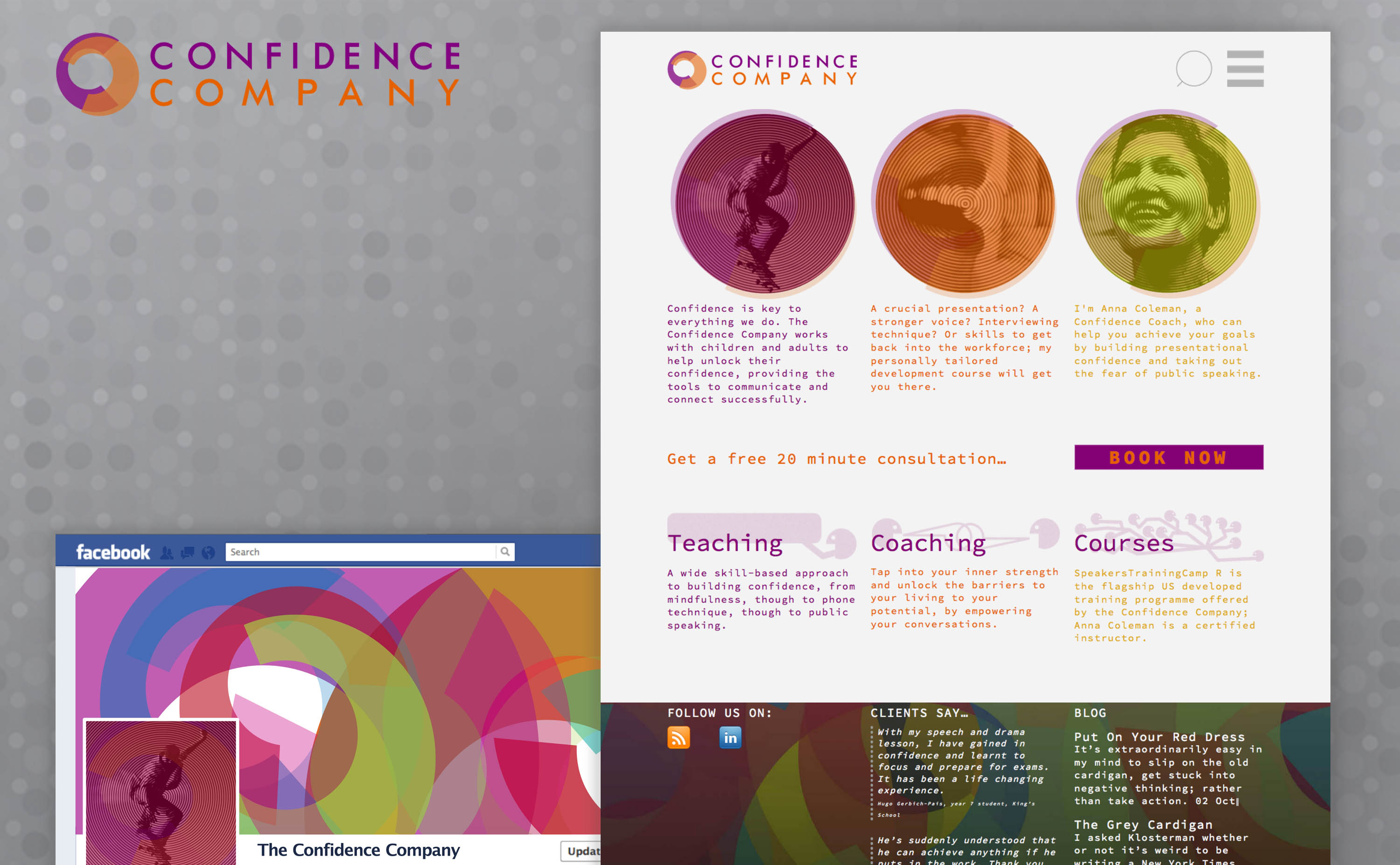
Anna Colemans mission is to help kiwis express themselves better - so designing first identity, then site was an almost effortless exercise in just that.
Read More
Pages


