Skip to main content
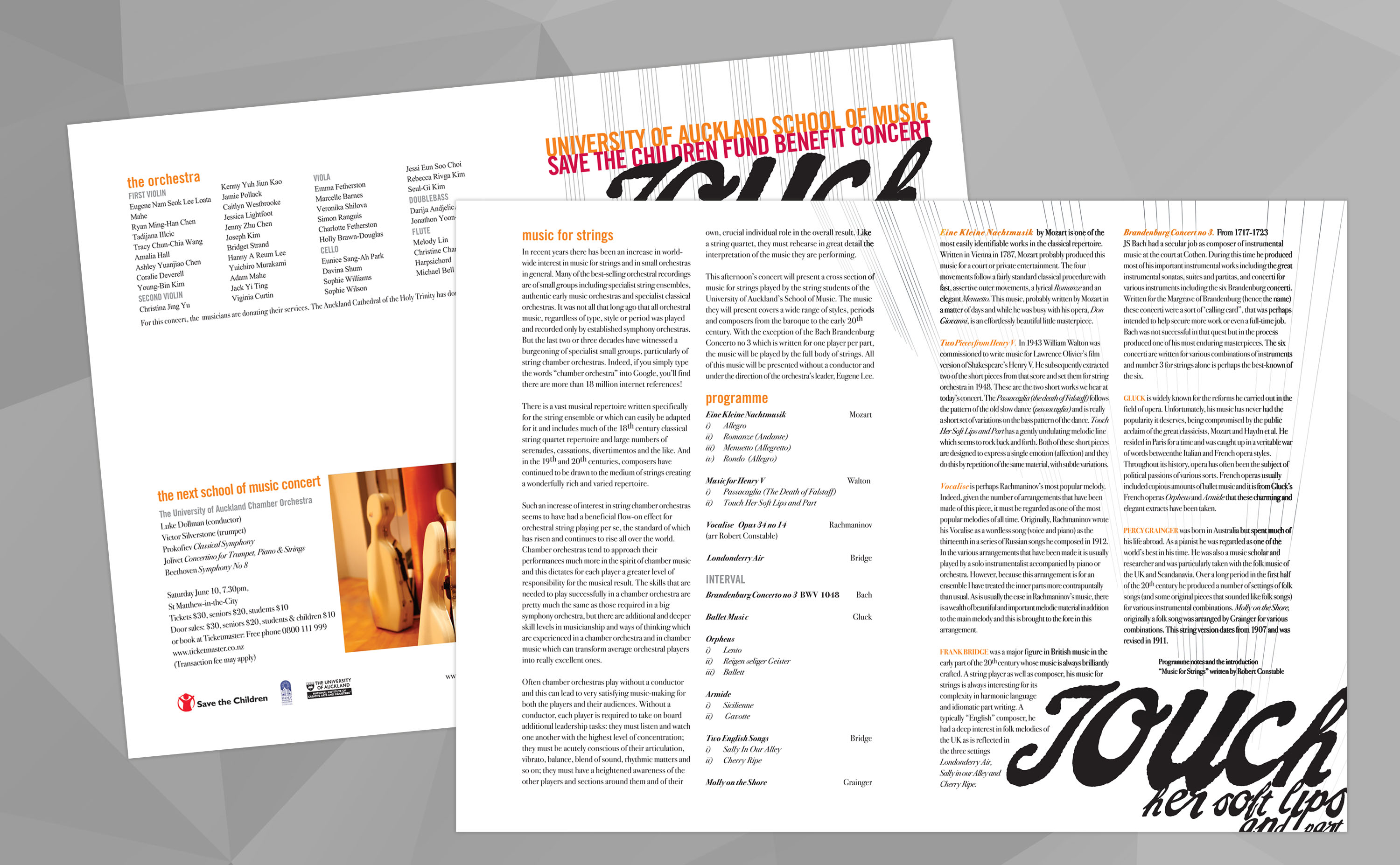
Inspiration comes easy when the brief is to promote sharp new musical talent. Even easer, when it’s in a good cause, such as this fundraiser for the Save the Children Fund.
Read More
For Inland’s design, I took my cue from some of the book covers of the 50’s and 60’s. (I have a hunch it was probably Janet Frame’s To the Island probably sent me there).
Read More
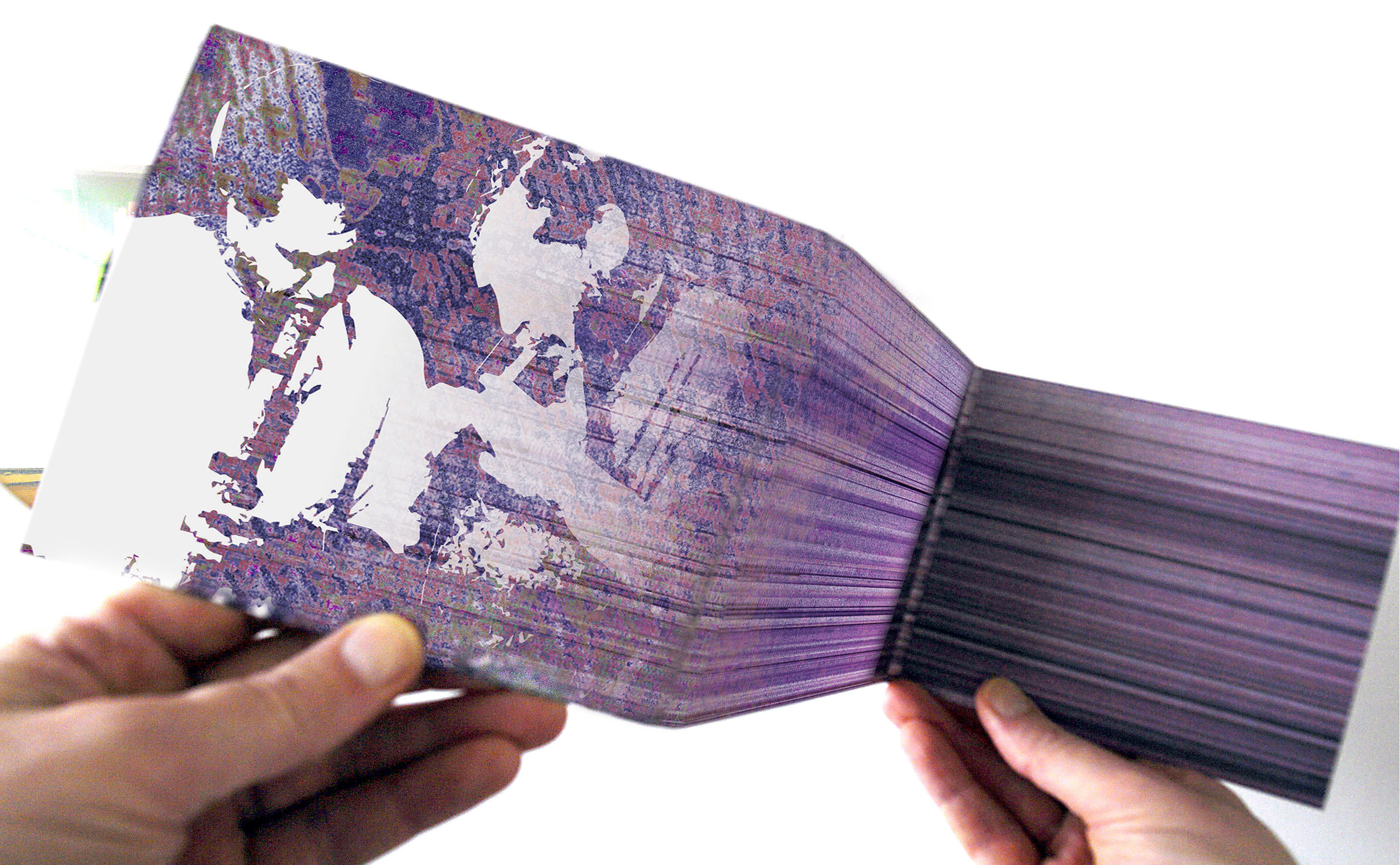
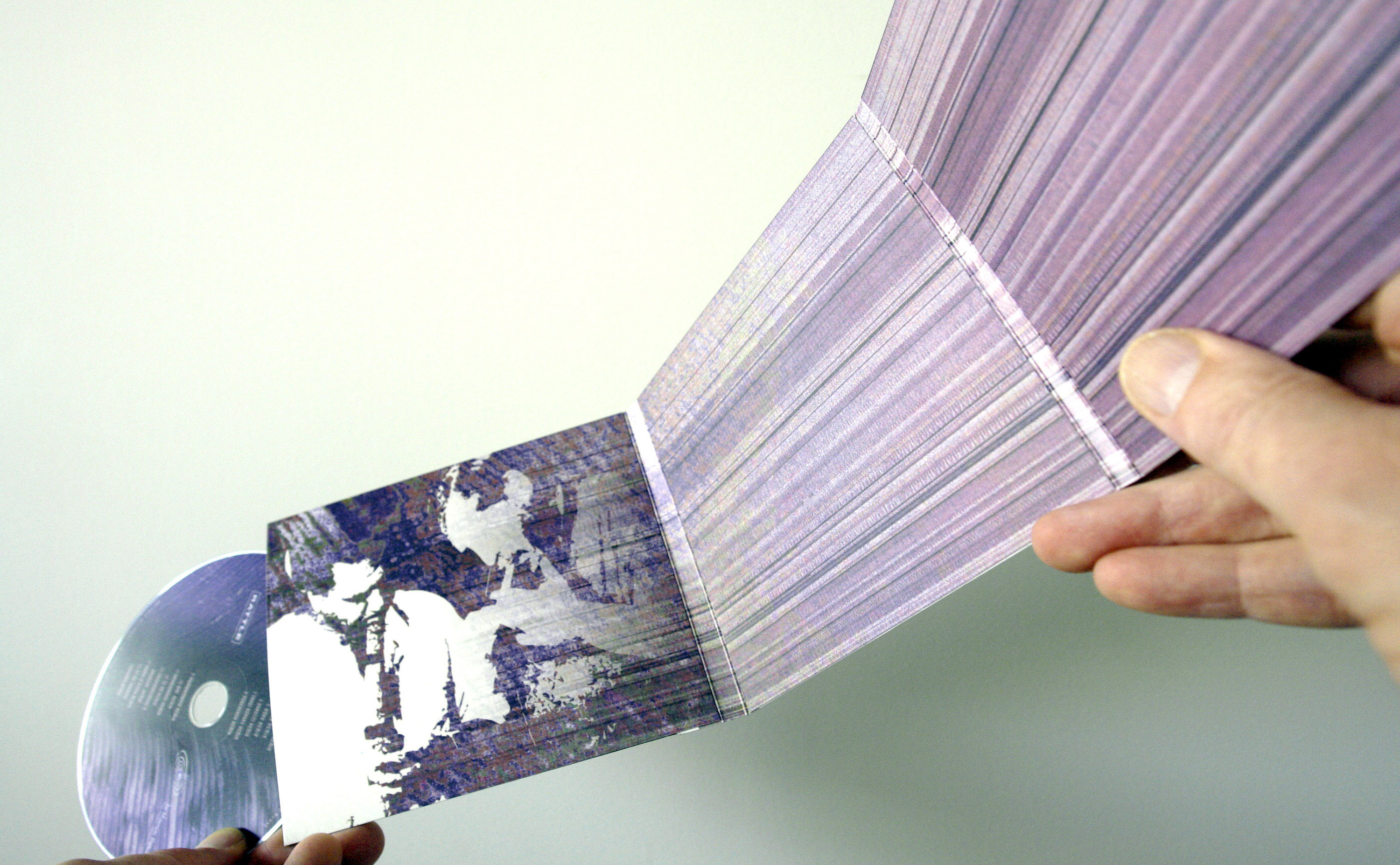
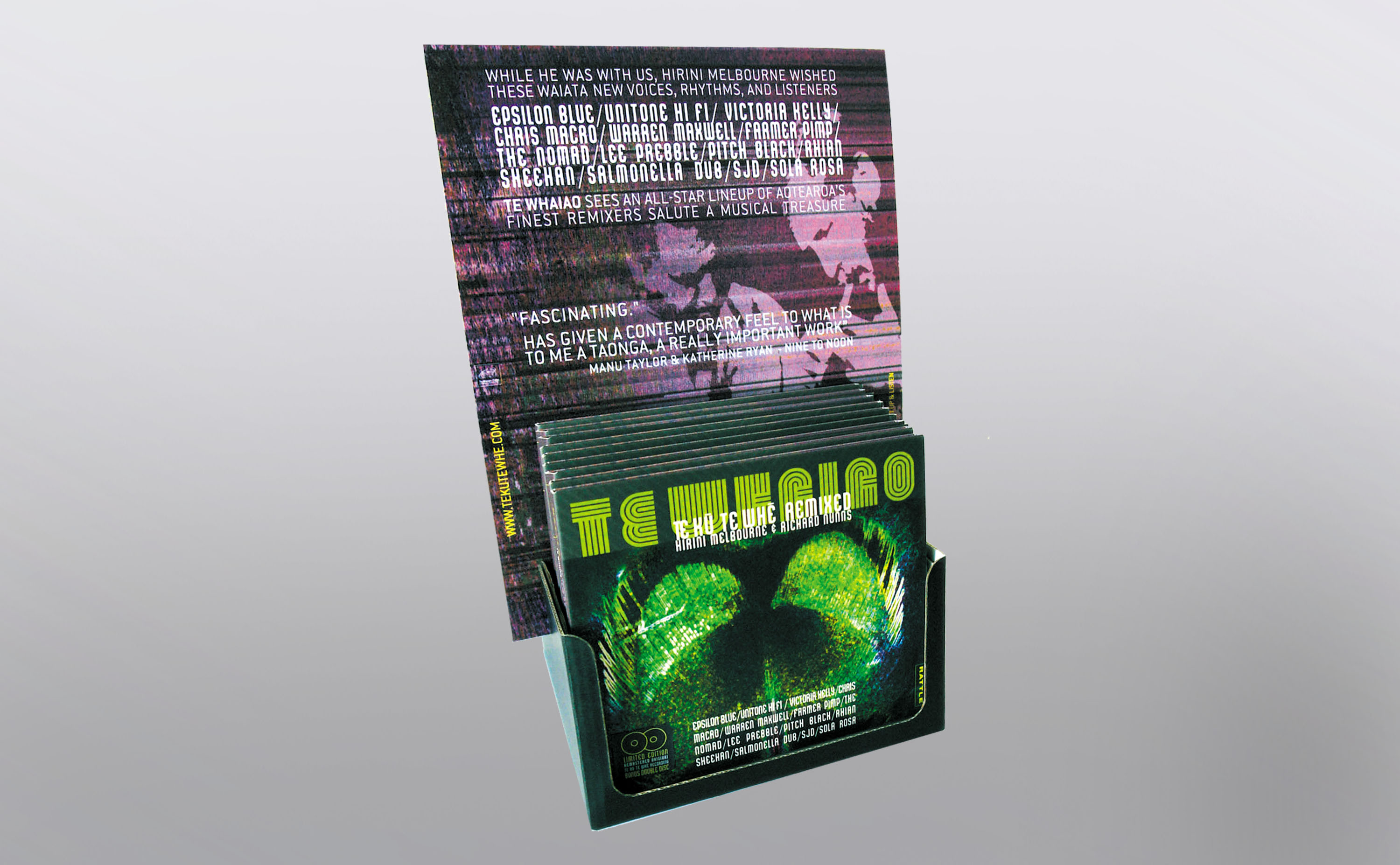
A dream team were challenged to remix a watershed Maori instruments album. So were we, when it came to the album’s design.
Read More
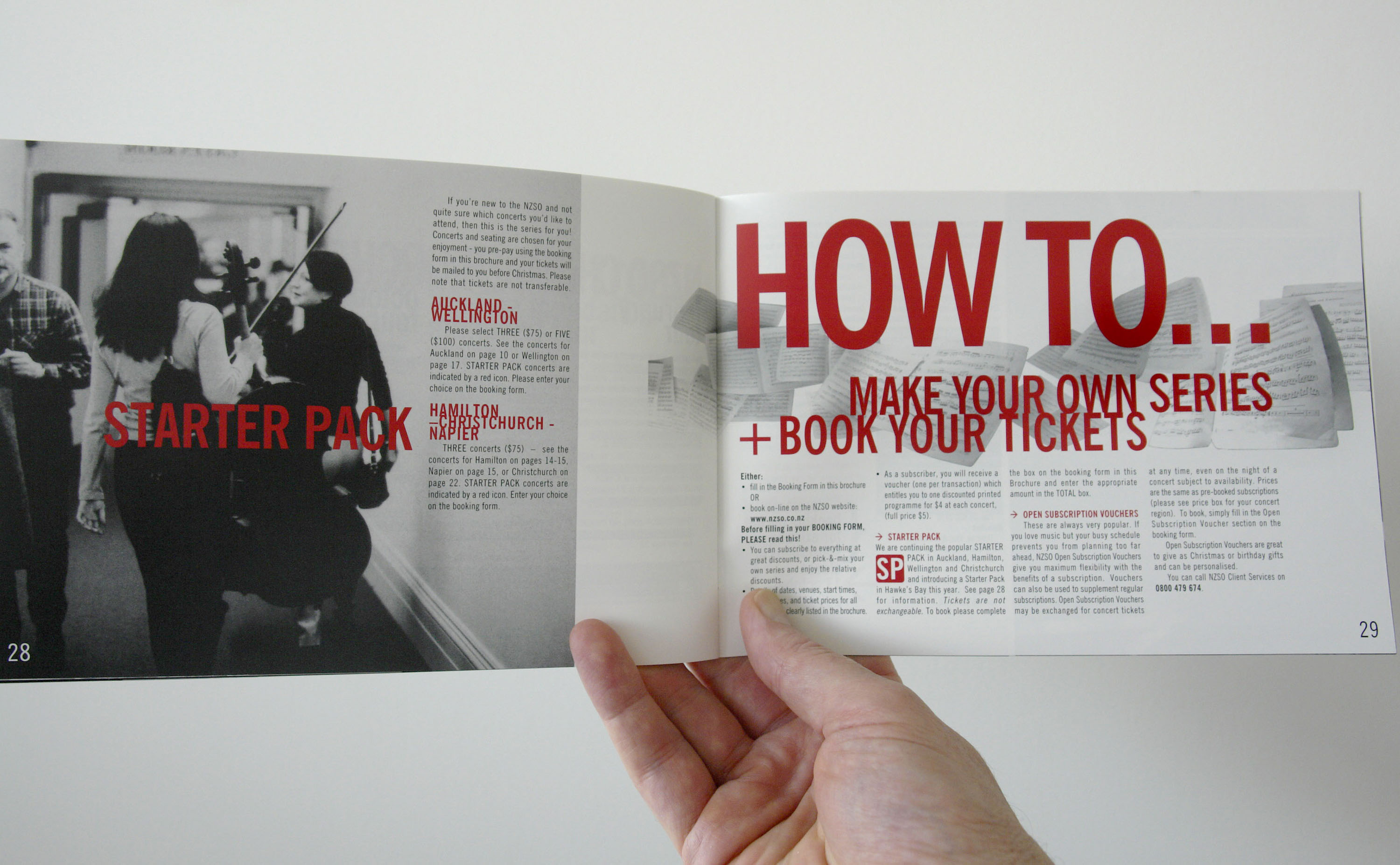
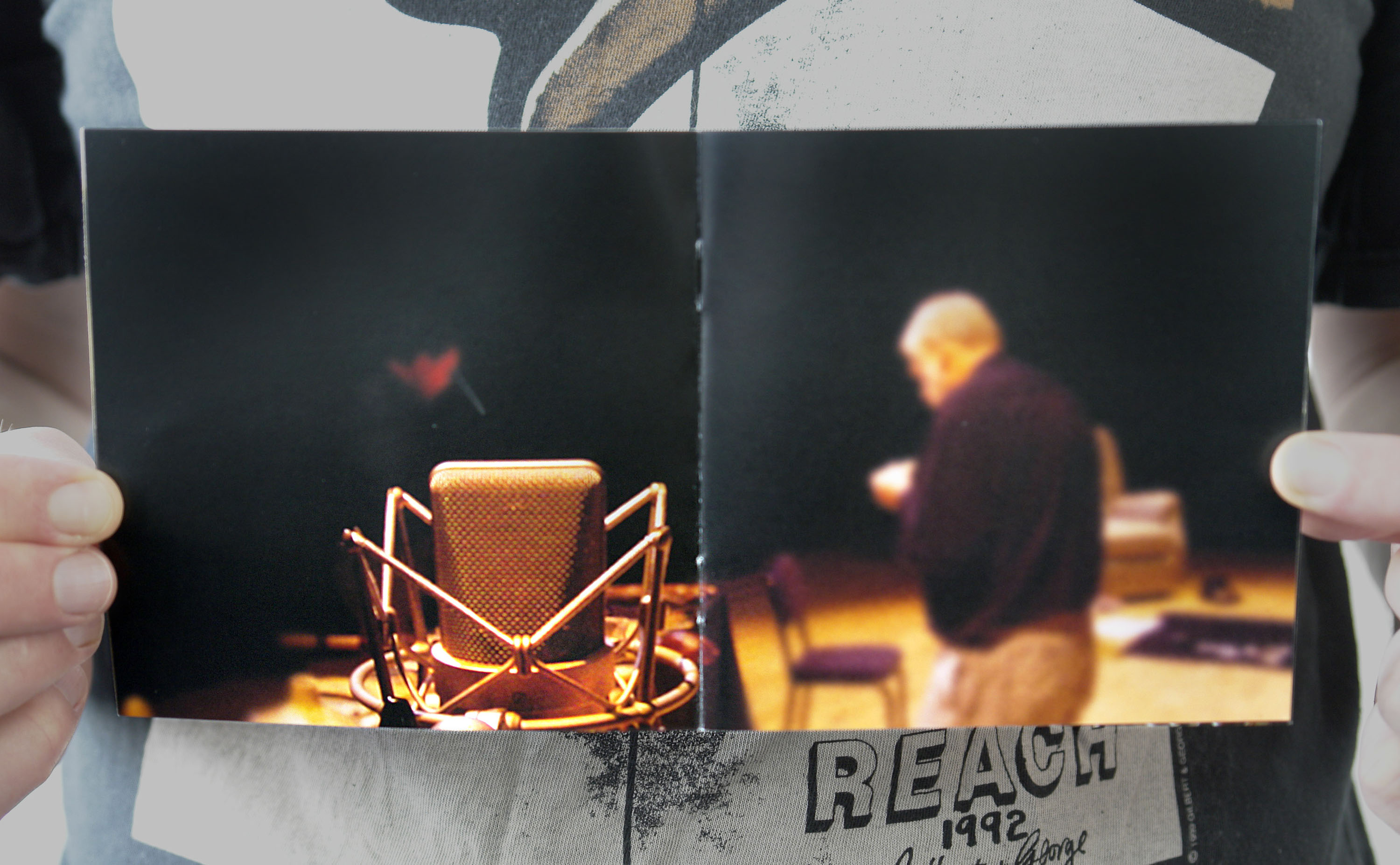
For the NZSO’s season design we opted to get close up, to present an intimate, grainy portrait of the orchestra, and the drama of its real performance dynamics.
Read More
When our most revered Maori instruments musicians regrouped to record again, I was privileged to be there with a camera – and an eye out for the album’s design to come.
Read More
All facets of the project came in for widespread critical acclaim, encouraging audiences to pull their perceptions of the genre back out of the too hard basket.
Read More
Rather than build a standalone site, this top tier composer sought a simple portal to the various existing avenues for his music; and an ID that referenced and complemented his latest album.
Read More
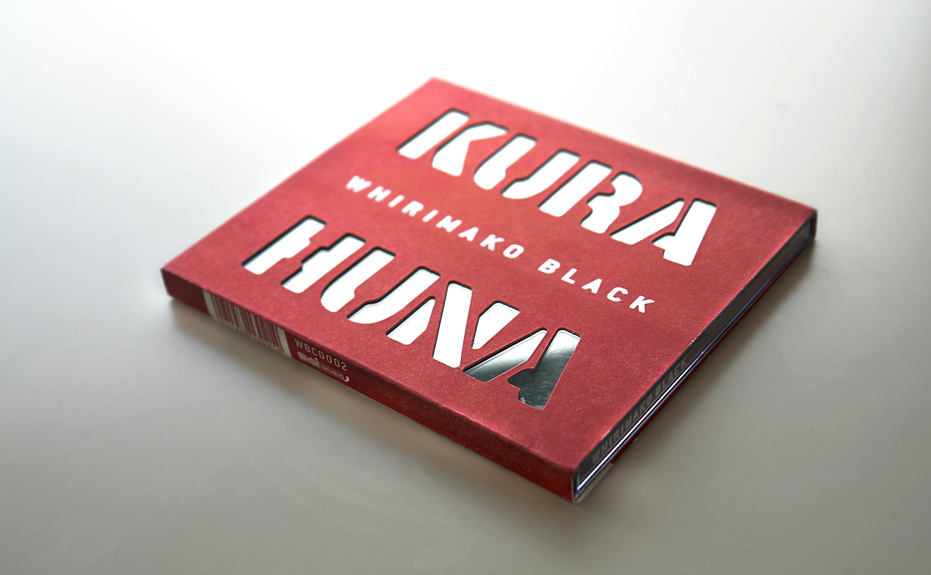
Kura Huna literally means Hidden Treasure – so, the design delivers a slow reveal.
Read More


