Skip to main content
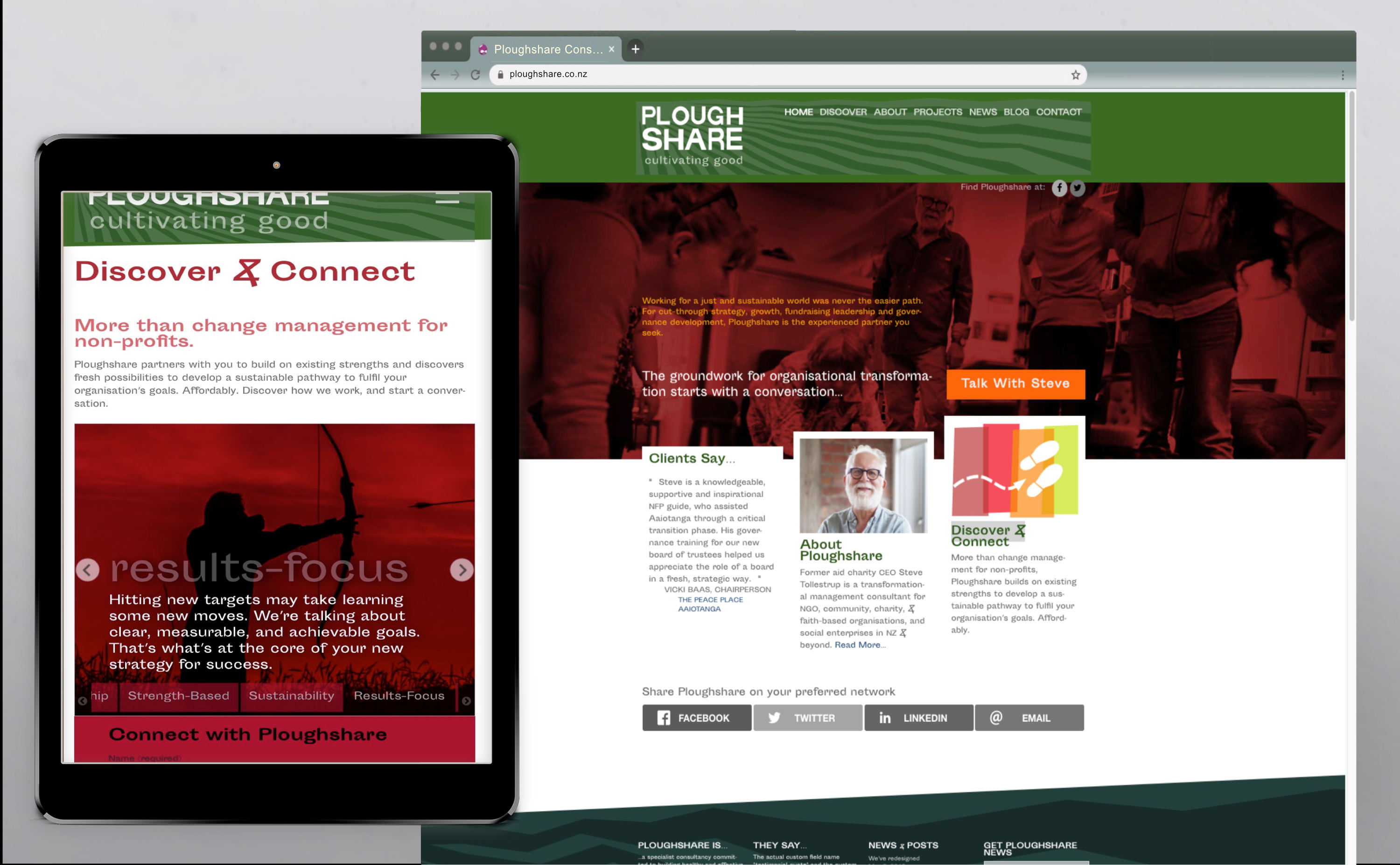
For a specialist consultant, assisting not-for-profit organisations, cookie-cutter branding and web UX wasn't going to cut it. So we knew we were speaking the same (design) language.
Read More
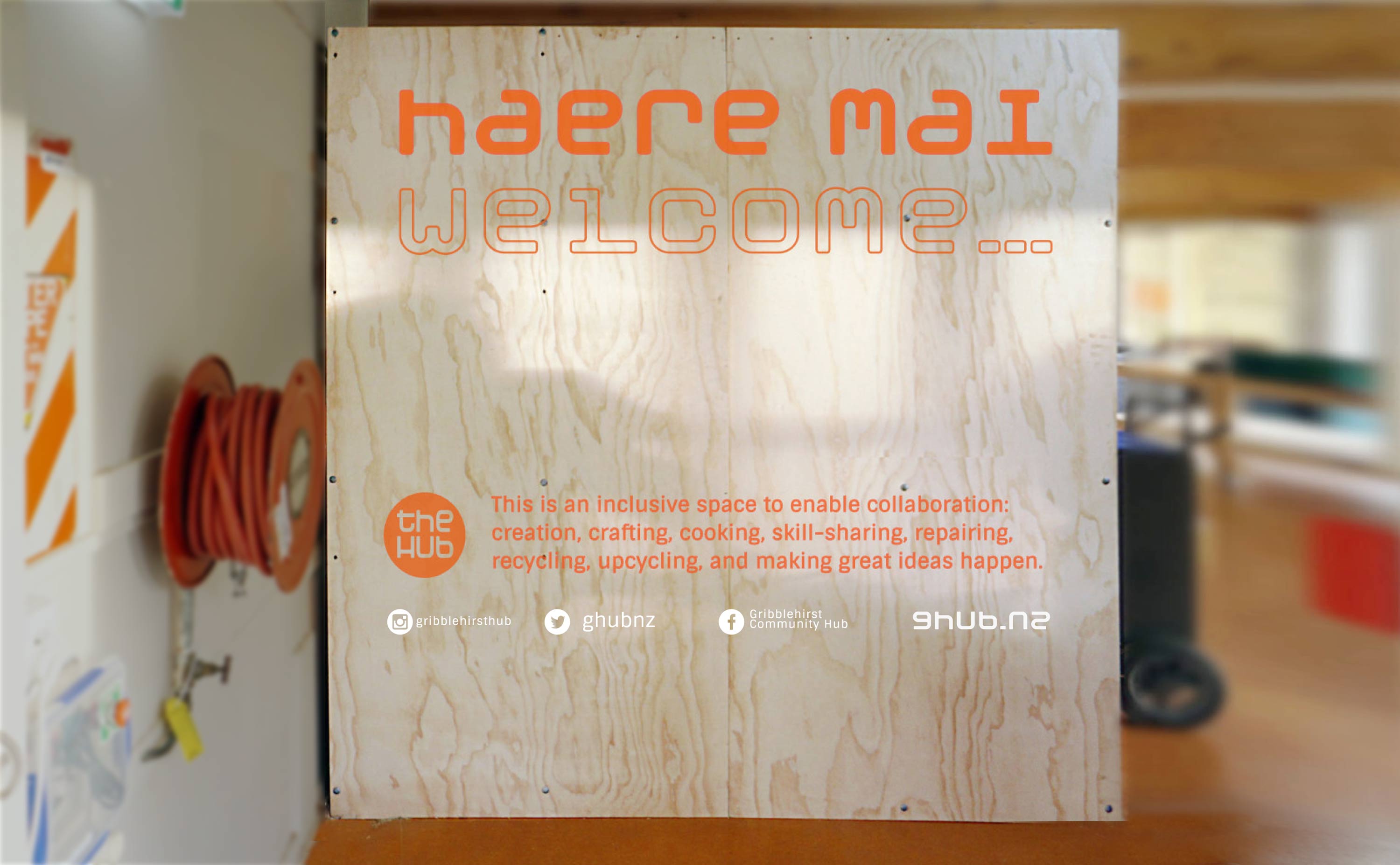
This new neighbourhood hub is ambitious to build community. A light front-end belies some strong bones beneath.
Read More
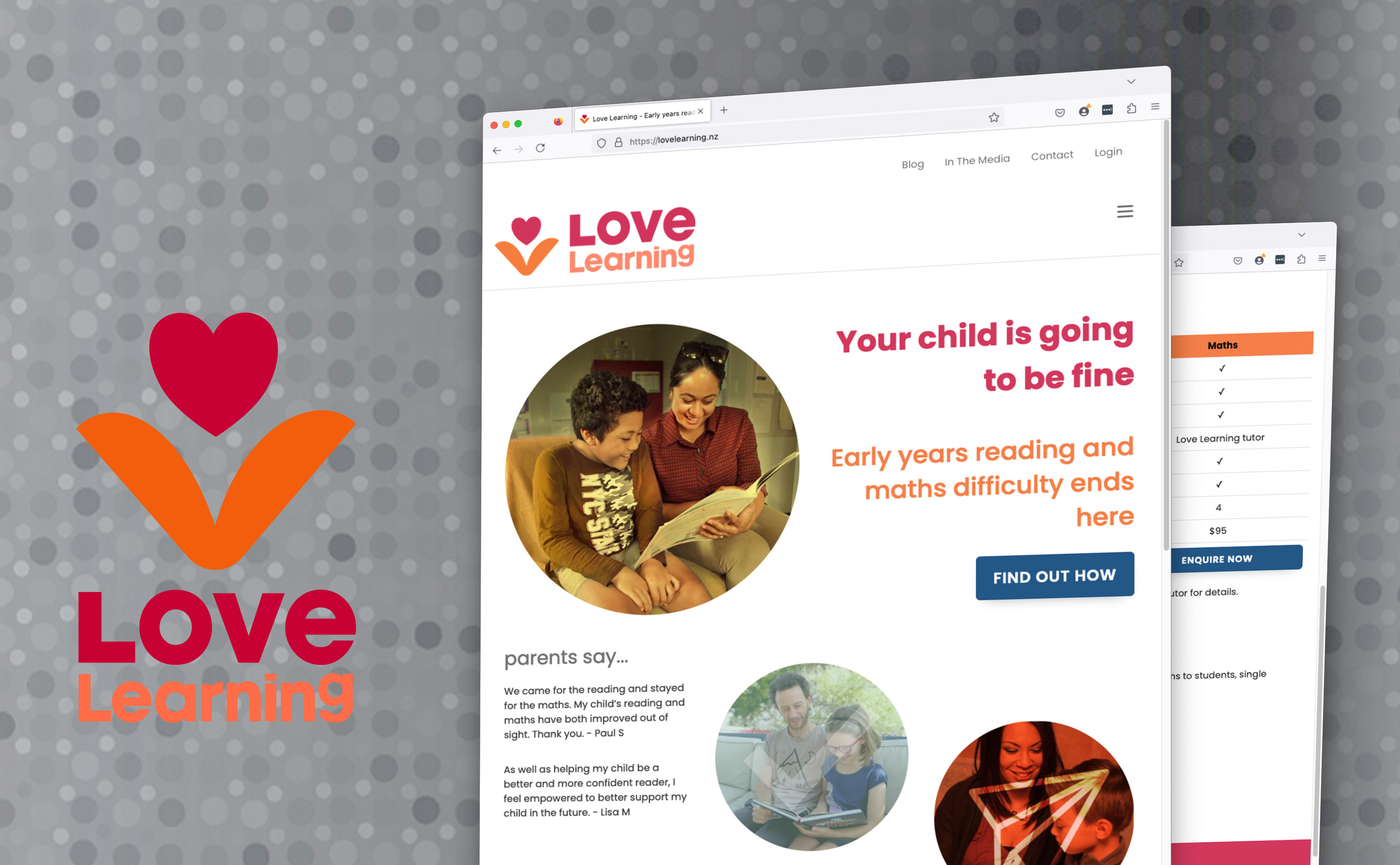
This remedial reading innovator got Digital strategy, some atypically logo-centric branding and initial site development, SEO, and content support.
Read More
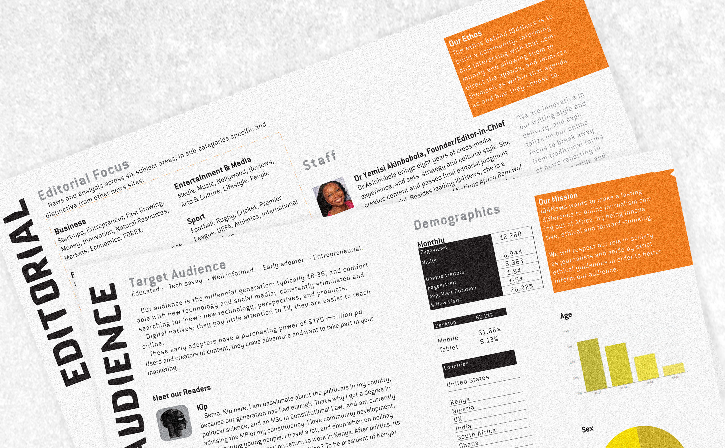
A plucky indie african news service wanted an ID with the edge to represent it's journalistic acuity.
Read More
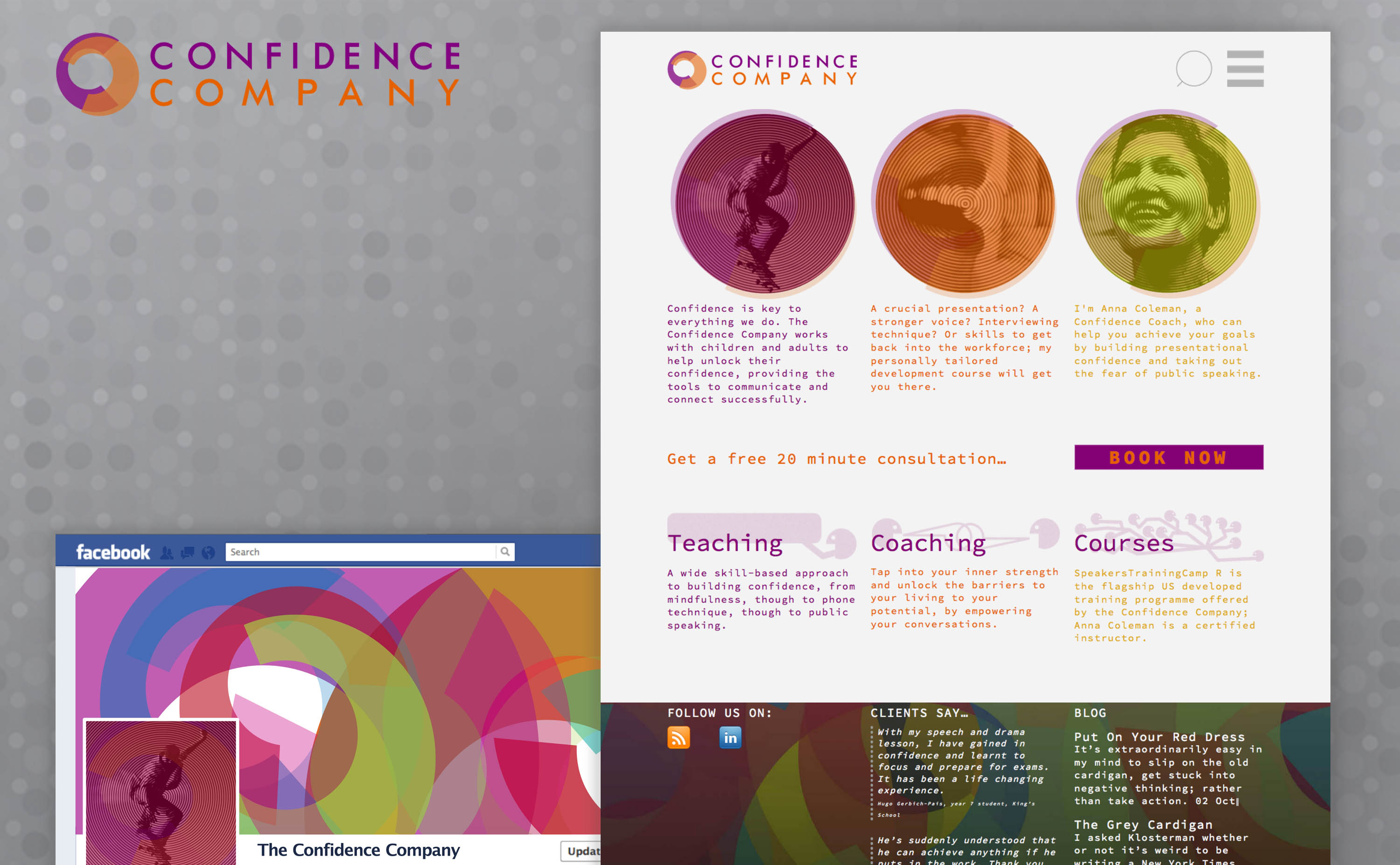
Anna Colemans mission is to help kiwis express themselves better - so designing first identity, then site was an almost effortless exercise in just that.
Read More
A new wave of cohousing communities is emerging. I developed cohousing.org.nz to help profile and network these developing 'coho's.
Read More
Smart Transport popped up awful quickly, to offer kiwis a clear voice on sustainable transport options for a post oil world. Their online vehicle was a fast mover too.
Read More
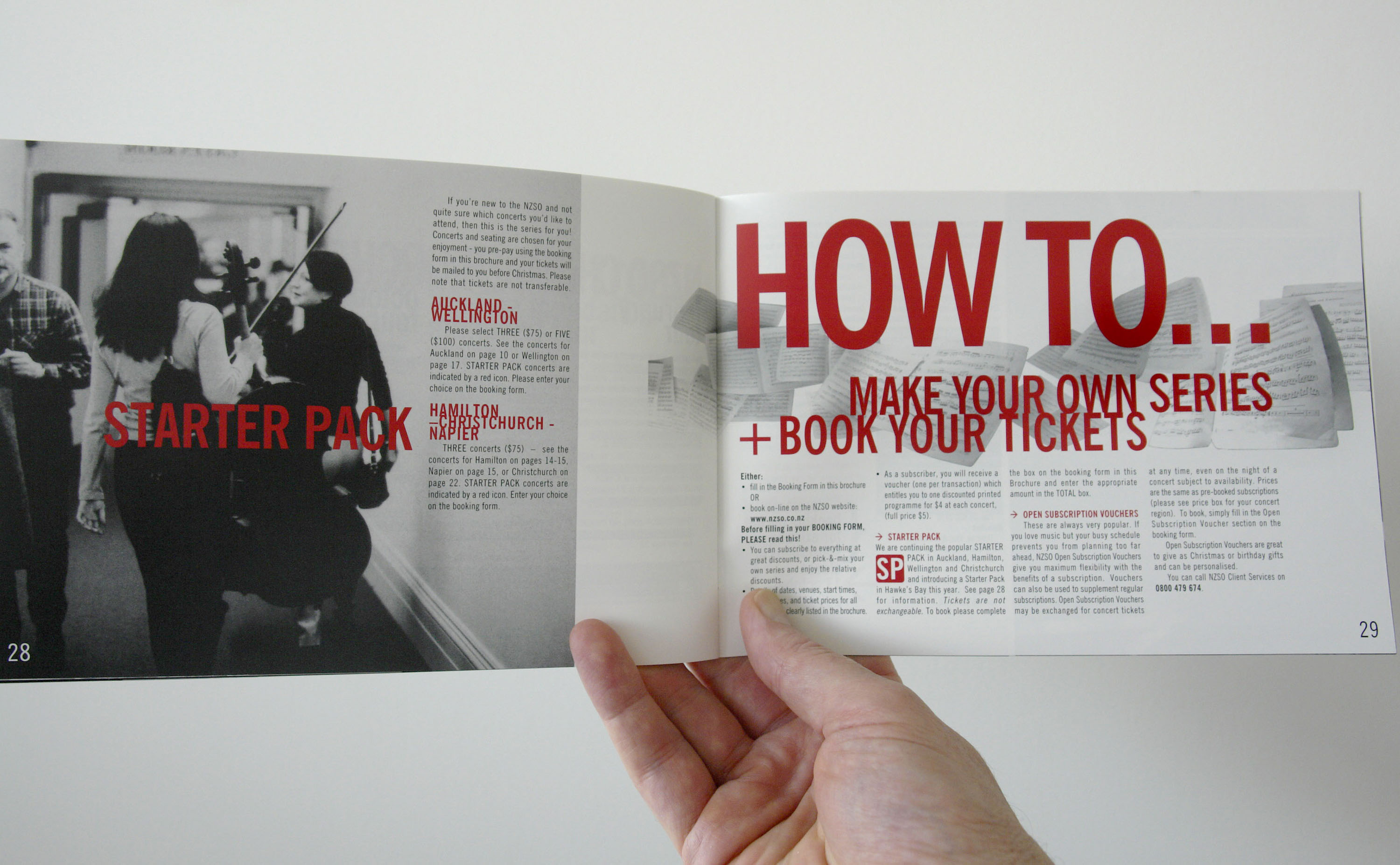
For the NZSO’s season design we opted to get close up, to present an intimate, grainy portrait of the orchestra, and the drama of its real performance dynamics.
Read More
Rather than build a standalone site, this top tier composer sought a simple portal to the various existing avenues for his music; and an ID that referenced and complemented his latest album.
Read More
A call to develop an online presence and for arts-led projects addressing sustainability and ecology hit all the right spots for us.
Read More
Bicycles are a barometer for a city’s liveability A meeting place of urban design professionals and cycling advocates needed a name and a face. “
Read More
Community agency ANCAD, on Auckland's North Shore, looked to share the good news coming out of its Shore To Thrive program, in partnership with Takapuna Methodist Church.
Read More


